Monday, September 21, 2015

Design Presentation

In my personal opinion, based on years of experience, good design is something that takes time to learn. You learn good design aspects by trial and error. It also helps to have the eye for design, a talent many wish to have. I learned the basics of good and bad design through my experience as a graphic designer. Since the age of 14 I had the opportunity to work for my dad at his business designing various forms of collateral. Ten years later I am still trying to improve my design techniques and learn with all the advancements in design technology. Because of my extensive background in designing for collateral I chose to focus my critique of good and bad design in just that. More specifically, business cards.

Bad Design:

Ok, I don't mean to bash on someone's design... which I am sure they worked hard on... but it is evident that they lack the experience and know how on how to produce an effective and good design for a business card.


Here is a classic example of bad design. The key to business cards is to keep it simple while still being intriguing enough to capture the attention of the recipient. Starting with the font, we have a hard time distinguishing a lot of the words. Use of multiple fonts make it confusing and hard to read. The business of the combination of graphics, colors, and words make it so many won't even bother taking the time to read it. A business card to express what it is the company does with out even reading the card itself. A multi-colored graphic of a map of the world does not easily correlate to a marketing business. Overall it lacks the needed simplicity, has crowded proximity, and begs for similarity. 

A side note to also pay attention to, especially those who are going into graphic design, FOCUS ON YOUR LOGO!!! A logo is branding for a company. A bad company logo will produce a bad reputation for the company you work for. The logo should be clear, concise, and relate-able to the product you are trying to sell. 


Take the time to take a step backwards and look at your designs from a distance. I might even suggest having a friend, preferable one with his or her mind constantly in the gutter, to give a critique of your created logo.


Good Design:

Designed by Jamie Wieck


In my personal opinion, this is a wonderfully designed business card. It is creative, simple, and actually has a purpose! This is a business card for a florist designer. While the outside appears to be a very simplistic business card, it is easily readable with no noise. It portrays its business logo and contact information clearly and legibly. The colors and font provide the sense of similarity in the design. The proximity of graphics and font in relation to each other is spaced ever so nicely, allowing the space to breath and the reader to able to discern what the product is easily. The frame of the business card provides closure. What I find so wonderful about this particular design is the continuity of it. Within the business card are seeds, and following the directions on the back of the business card allows the recipient to actually grow a sample of the product they are selling. This is continuity at its finest, since the business card goes further than just portraying information, but also giving you an example of the actually product itself, and continuing the curiosity.

Monday, September 14, 2015

Contrast, Balance, and Harmony

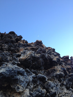
This picture was taken on one of many random hikes with my husband. We decided to hike one of the volcanoes in St. George, the Holocene Volcano. Instead of being sensible and taking the trail up to the top... we embarked up the steep side. Half way up I stopped to catch my breath and took this picture.

Shown here is what the steep side of the volcano consisted of, hard porous volcanic rock with decaying vegetation. Peering above the rock we see the soft blue of the evening sky and a sliver of the moon in the distance.

This picture shows contrast between the texture of the hard brittle volcanic rock and the soft blue sky. We can also see a contrast in the regards to color, the dark grey black tones versus soft hues of blue.

This picture gives us a sense of balance by how the juxtaposition of the rock within the frame of the photograph. The harshness of the mountain side cuts up at a diagonal  angle cutting the photograph almost in half. The backdrop of the sky provides a balance distinguishing the foreground from the back ground.

I feel like this photograph presents harmony in regards to the colors portrayed. All are cold colors which present a calm harmony. I also feel that everything in nature is harmonious and placed in relation to each other for a purpose.

Wednesday, September 2, 2015

Visceral Response

There will always be a special place in my heart when it comes to sunsets. I find the vivid colors weaving through the wispy clouds at the end of a long day to be breath of fresh air and relaxation to keep me pushing forward in this life.


This particular sunset was towards the end of 2014. My then fiance and future brother in law went out to ride our dirt bikes in Parowan, UT. As the sun set we all stopped and quietly took in the last few minutes of beauty this day had left us.


The contrast of colors between the horizon line is remarkable. Below the horizon line the land seems gray, desolate, barren, and hopeless. Above the horizon line we are graced with vivid bright colors portraying a variety of blue, yellow, and orange hues. Earth's way of giving us one last glimpse of stupefying beauty before our lives are yet again surrounded in darkness. The reflected light of the sunset, off of my hair, represents a longing for the beauty to last and a hope for it to return.